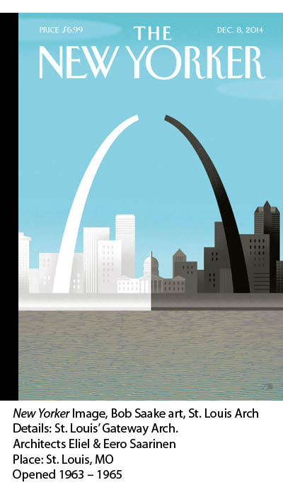
A broken arch. This is a powerful image that speaks to a particular time and place in American history. That’s what the New Yorker editors wanted to illustrate the divided city for their Dec. 9 #Ferguson cover. Artist Bob Staake may have been chosen for the job because he has employed architectural Icons in the past to make a point. In this case, he used the St. Louis arch to symbolize a persistent undercurrent of cultural racism. Eliel & Eero Saarinen built The Arch to mark the “Gateway to the West.” (opening in 1965, ironically, during the peak of the Civil Rights struggles.) Could the Staake image stick as a negative and potent new meaning for American Midwestern urbanism — racism? Architectural Icons matter.
Here’s what Staake says about why he uses architectural Icons.
“So many of my most popular New Yorker covers do utilize architecture to make a point—my Obama victory cover with the Lincoln Memorial or the gay union cover with the White House with the rainbow columns. I use established architectural iconography to go ahead and make a point. But most important to me—and certainly that’s the case with this ‘Broken Arch’ cover—is I want to go ahead and present imagery and elements in an almost enigmatic way, in an abstracted way that really demands a reader to go ahead and flesh it out. It’s remarkable to me how many different interpretations one can have of this one cover. Some people, they find it heartbreaking, it makes them cry. Other people, they say, ‘That’s not how it is.’ This is a wonderful thing when a single piece of art with just color and form and a very, very simple cover design, it can engender that sort of a dialogue.”
~ artist Bob Staake
